Friday, April 21, 2017

Network Analysis

GOALS AND OBJECTIVES

This lab explores network analysis tools. Network analysis uses networks, in this case road networks, to model routes, distances, and travel times. Whereas traditional analysis uses straight lines, "as the crow flies" routes, from one point to another, network analysis can more accurately analyze how far and how long it takes to travel between points. The tool has a wide range of applications, from routing emergency vehicles on the quickest path, to modeling waterway networks, to finding travel routes around construction zones. Applications of this network analysis are widespread.

In this lab, the sand mine data used previously will be studied here. The goal of this lab is to find hypothetical costs associated with road wear caused by heavy mining vehicles using public roads. To do this, routes must be established that the vehicles will take, then the distance of these routes needs to be determined, followed by the total cost calculated from this distance.


METHODS

This lab began with a Python script (can be viewed here under script 2) that used SQL queries to find mines that would need to use roadways to transport frac sand. This was done by removing deactivated mines and mines that are connected to a rail terminal. Next, the script used a select by location to remove mines that were 1.5 km from a rail terminal, as these would have spurs built that would eliminate the need for roadway transport. The script was run and the relevant mines were extracted successfully.

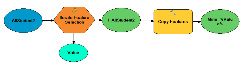
These mines were then brought into ArcMap, along with rail terminal locations and road network analysis features. To minimize error, the network analysis was then done with a model. This model is shown below in figure 1. The three inputs: streets, mines, and rail terminals were used in the network analysis tool to find the closest route from each mine to a rail terminal. These calculated routes were copied and exported to a new feature class. A map showing these routes can be seen in the results section.

Figure 1: Model created for network analysis

Next, a model, shown in figure 2, was used to estimate the hypothetical cost that vehicles using the routes would incur on roadways. The cost was estimated per county. First, in the model, the routes were projected to a Wisconsin HARN projection to minimize distortion. next, the routes were cut along county lines with the identity tool. This was done so distance calculations within counties would be limited to sections of routes that fall within the county. The identity tool added fields to the routes that had data on which county each section of the route was in. The summary statistics tool then merged all route sections by county to determine total distance of route in each county. Add and calculate field tools were then used to take this distance, convert it into miles, multiply this by a hypothetical cost of 2.2 cents per mile and 50 trucks making a round trip per year. The numbers used are hypothetical and could be easily changed by altering variables in the model.

Figure 2: Model created to estimate cost per county for road usage


RESULTS AND DISCUSSION

Shown below in figure 3 are the routes that were predicted from each mine a rail terminal. Notice there are some rail terminals that connect to multiple mines. Also, overlapping routes are still considered to be separate routes, so distance is calculate individually per route. This is why, as will be shown in the cost calculations, counties with a dense network of routes have a higher predicted cost than counties with a single, long route.

Figure 3: Routes from mines to rail terminals

Below in figure 4 is a chart showing estimated costs per county. This was created by exporting the table created by the second model to Excel. There are many counties with negligible calculated costs as a route only briefly passes through. The counties with the highest costs have dense networks of predicted routes. The calculated costs for roadway wear were relatively low compared to the scale and cost of sand mine operations. Of course, the cost per mile, one of largest factors, was just a hypothetical estimate in this exercise and the actual cost per mile could be much higher or lower.

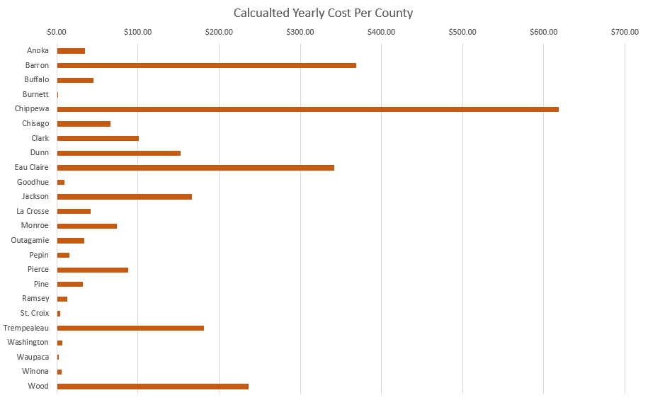
Figure 4: Chart showing hypothetical yearly costs per county

Lastly, shown in figure 5 is a map depicting estimated costs by county.
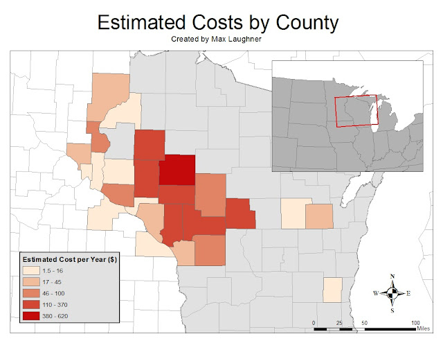
Figure 5: Map showing hypothetical yearly cost per county
The best way to mitigate these costs would be to ensure there are rail terminals close to areas of high mine concentration. With many mines in Chippewa county, the highest cost county near the center, a rail terminal could be build near the center of the cluster to greatly reduce mine-to-rail distance.

There are many assumed variables that cause uncertainty in this estimation. Beyond the hypothetical values used for estimating cost, the method of analyzing routes should be considered. The model chose the route that takes the least amount of time. This may not be accurate, as in reality, routes would also be directed away from high-traffic areas, along with other factors. These factors can be assessed with the network analysis tool with access to pertinent data.


CONCLUSION

Network analysis is a robust tool with widespread applications. Despite this, the tool is relatively easy to use and adapt to fit the application. As shown in this lab, the results from the tool can easily be used in conjunction with other tools as needed. While specialized uses for network analysis, such as cost estimations, are common, even more common is its use in personal routing. Entering a location into Google Maps, for example, uses network analysis to determine the most efficient routes to take. The usefulness of network analysis cannot be stressed enough.


Friday, April 7, 2017

Data Normalization, Geocoding, and Error Assessment


GOALS AND OBJECTIVES

The goal of this lab was to explore geocoding. Geocoding involves using software to match up location descriptions, such as addresses, to actual coordinates on the Earth's surface. In order to geocode, the data had to be sufficiently normalized. This was done by manipulating tables to create similar data for each entry in the table. After geocoding and manual cleanup, error assessments were made to analyze the success of the process.

This lab served as a continuation of the previous frac mining labs. This meant that the data used was frac mine locations, whose locations were given as addresses or described with PLSS. The results from this lab will be used in subsequent labs using network analysis.


METHODS

Before the data could be used in any meaningful way, it had to first be normalized. The goal of normalization is to have a uniform style of data entry so data could easily be compared and analyzed. The initial spreadsheet used is shown below in figure 1. All the location data is given in a single column. Notice the variety of location descriptions. There is PLSS descriptions mixed with addresses. Some have both or only one, and there is no uniform method of entry.

Figure 1: Data before normalization
To normalize the data, entries were split into separate columns: an address column and a PLSS column. This is shown below in figure 2. The geocoding software uses addresses only, so PLSS data would just be for manual cleanup after the geocoding had been run.

Figure 2: Data after normalization
With the data normalized, it was ready to be geocoded. The spreadsheet was brought into the geocoding tool on ArcMap. This tool analyzed the address and town fields to find possible matches for locations. This could only be done on entries with addresses given. For entries with only PLSS locations, the estimated location was automatically chosen at the center of the given town. A visual of this process is shown below in figure 3. First the PLSS township was found, as shown on the right. In this example, the PLSS township was 33 N 13 W. Next, the subsection was used, as shown in the middle. This mine was described as being on the border of section 29 and 32. The area was searched for a mine and found, as shown on the right. The location, as marked by an X, was placed on the road to ease in network analysis for future labs.

Figure 3: Using PLSS data to find mine locations
This was done for all mines with PLSS data. All other mines were similarly checked to make sure the location was marked at the entrance of the mine. Many of these were off and had to be manually corrected, as the geocoding software uses approximations to guess locations for addresses.

For error analysis, the data was compared to both the class's data and the coordinates given by the data provider. Comparisons were made in a similar way for each. For comparisons to student data, all mine shapefiles were merged into a single feature class and projected in in Central Wisconsin State Plane projection. The lab was designed so there was overlap enough so each mine was located by several students. This meant the feature class had multiples of the same mines. Once this feature class was created, a model was made to split each unique mine into separate feature classes. This model is shown below in figure 4. The model iterates through the feature class containing all mines and groups mines with the same mine ID into their own feature classes, naming each output file by the unique mine ID. This was done so each student mine locations could be compared to the corresponding mine location I found. These distances would be averaged to find average distances between my mines and mine locations found by others.

Figure 4: Model created to split unique mines into separate feature classes
This same process of splitting to individual mines was used to the shapefile of actual mine locations given by the DNR. In this case, however, there was a one-to-one ratio of mines being compared, as I was not using data from multiple people.

After error analysis was completed, maps were created showing the comparisons of mine locations I found to locations found by other students and to those given by the DNR.


RESULTS

The error calculations performed are shown below in figure 5. Notice there are many more mines being compared under student mines because there were several instances of each mine compared. The averages, or average distance between my mine and other mines, were both around 1700 m.

Figure 5: Error calculations

Shown below in figure 6 is the map created comparing my mine locations to those of other students. Notice that many mines overlap, some completely. There are some outliers, however. Most of these are from a student choosing the wrong mine in the area.

Figure 6: Comparison of my mine locations to those found by students
Shown below in figure 7 is the comparison of my mines to the "actual" locations given by the DNR. I hesitate to call them that because many of these DNR locations have low precision, and are placed a distance from where the mine is clearly located on aerial imagery. This is a cause of higher error found previously.

Figure 7: Comparison of my mine locations to those given by the DNR


DISCUSSION

Using the model turned out to be an excellent way to efficiently split feature classes for easier use. Doing this allowed me to compare all mines available rather than taking a sample and only comparing 10 or 20 percent of the mines.

There are a few sources of error that make the average distances non-zero. One is that not all mines analyzed are active. Some mines are closed and reclaimed as vegetated areas, with makes their precise location difficult to assess. For these, maps from different temporal resolutions were used. Some mines, however, were only permitted and construction had not yet begun. There was no real way to find precise locations on these, so locations were marked near open areas away from private residences. There were some mines that were found, but were large and had multiple entrances. This resulted in the lower end averages that are seen, as some students picked a different entrance than I. There were some instances of choosing the wrong mine, as some areas have a high density of mines and only have a vague PLSS description of the mine location, resulting in ambiguity of which mine is the correct one.


CONSLUSION

Geocoding is a powerful tool that is used by almost everyone. Typing an address into Google to find its location is an example of how geocoding is used in every day life. Geocoding as an analysis tool proved to be extremely useful, but not without its shortfalls. A significant amount of time was spent checking and correcting mine locations from either incorrectly estimated locations or the inability for the software to use PLSS location data. Nevertheless, the geocoding software has impressive abilities that become most useful when dealing with a large number of data entries. The amount of time it takes to locate entries with geocoding software is a fraction of the time it would take manually.